Nick Scala
Senior Product Manager
Rebuilding My Website
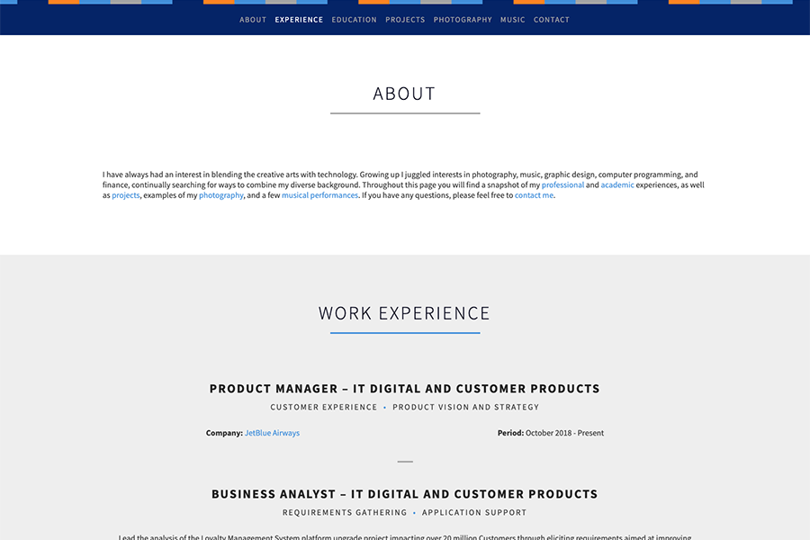
During the winter of 2021, I decided to dust off my old website and rebuild it. Originally created in 2013, the old website's information became outdated after years without updates and the overall experience felt stale and unengaging. I wanted to use this opportunity to improve my web development skills, refine my design skills, and test my product management skills on a project that when complete, would also serve as a platform to share my professional experiences and personal interests.
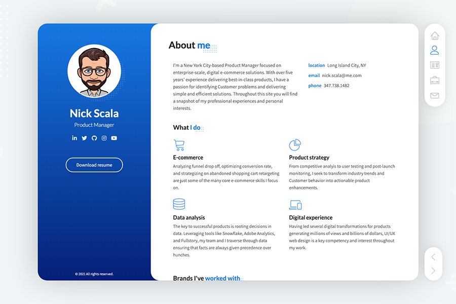
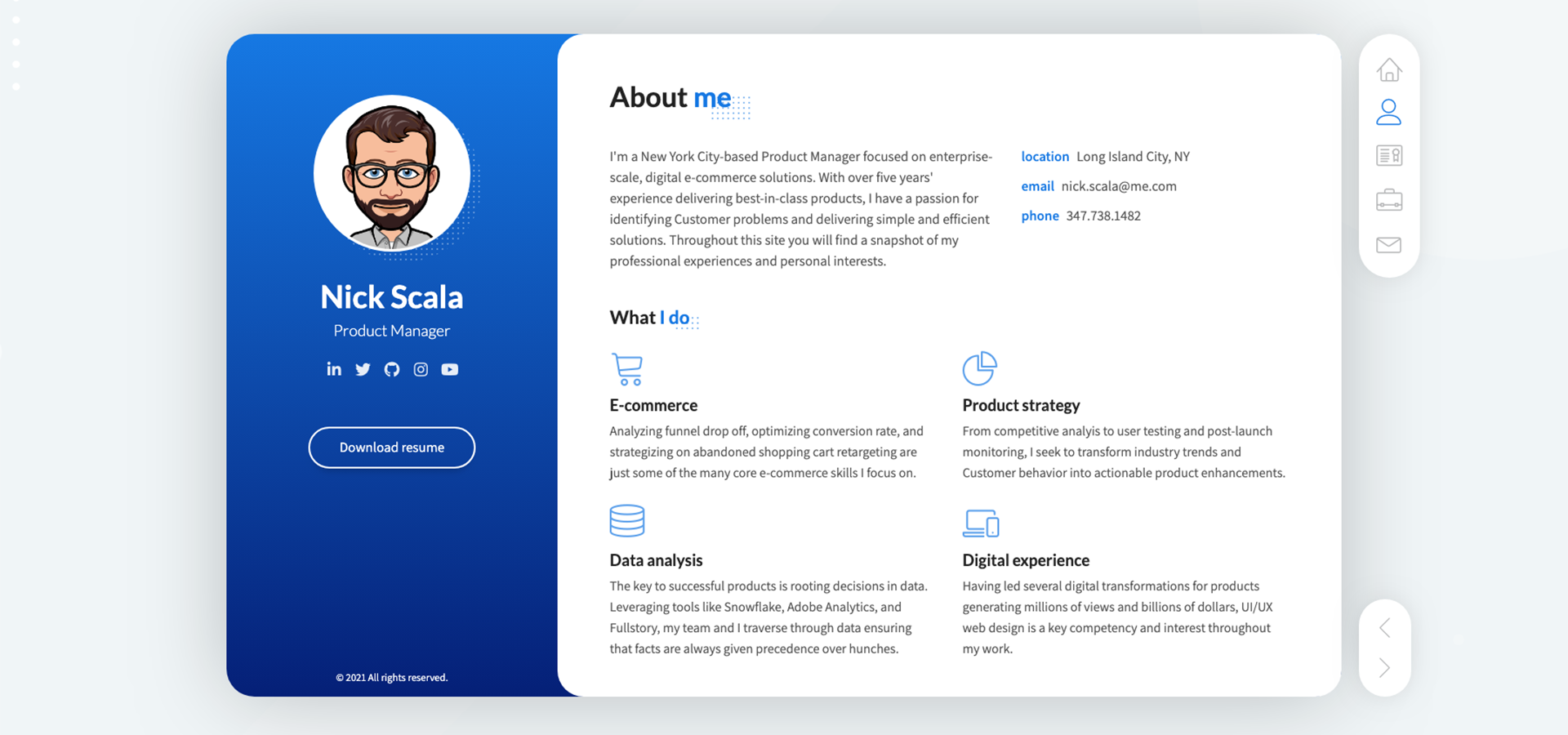
Although the website is built on top of an HTML5 template (no Squarespace, Wix, or WordPress here), there was a significant amount of work that went into getting the site into a state that met my vision. Below are the highlights of those efforts:
- Scoured the web looking for an HTML5 template that was unique, responsive with a great UX specifically on mobile devices, and well reviewed.
- Researched hosting providers that were reliable, fast, and cost effective. I ultimately selected GitHub Pages because in addition to meeting all three criteria, GitHub Pages also allowed me to establish a presence on GitHub and provide transparency into all of the commits I've pushed to the site. Then, I pointed my registered domain to the GitHub directory.
- Established a JIRA board, created user stories, and prioritized a backlog to keep all of my thoughts and tasks organized, ensure that no feature went forgotten, and build the site in priority order.
- Researched replacements for the template's PHP contact form solution due to known PHP security vulnerabilities and incompatibility with GitHub Pages before landing on Formspree's solution. Then, implemented custom JS that bypassed the redirect to Formspree's "thank you" page to improve the user experience and display a unique confirmation message natively.
- Integrated Zurb's TwentyTwenty image slider JS, CSS, and HTML to showcase before and after image comparisons like the one found above and on other pages throughout the site.
- Configured Google Analytics and Google Search Console tools so I can measure the success of the new site.
- Chose a blue color scheme as it conveys trust and dependability (important qualities for a product manager and a portfolio website) and then tested over 50 different blue gradients using tools like uiGradients before landing on #0575E6 and #021B79 as these shades felt professional, yet friendly and inviting.
- Tested 20 different sans-serif Google Fonts (Open Sans, Roboto, Montserrat, etc.) searching for a font that felt modern, but more importantly had good readability on screen and in print (for my matching resume) before landing on Assistant. Once Assistant was chosen as the body font, I looked for a complementary font for headings and selected Lato.
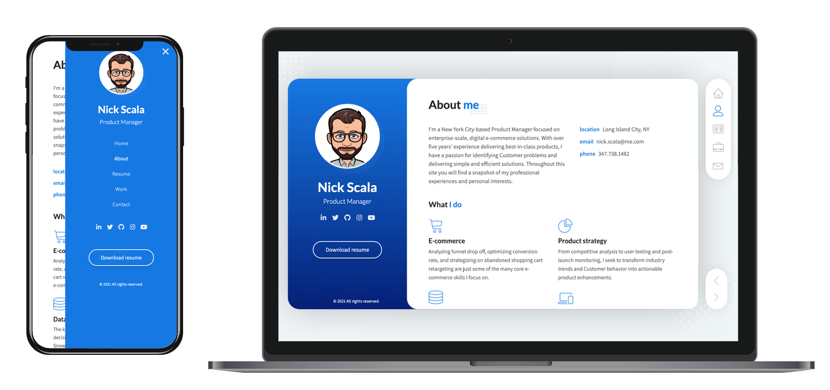
- Used Adobe Photoshop to standardize sizing and resolution of all website images, create device mockups like the one found below and on other pages to showcase responsive design, and create a custom favicon that matched the site's header font and blue gradient background.
- Ran Google's Lighthouse web development tool to identify issues and improve performance and SEO of the site.
- Ran Level Access' Web Accessibility tester to identify issues and improve accessibility of the site.
- Used Adobe InDesign to update my resume to match the font, colors, and overall visual aesthetic of the site.
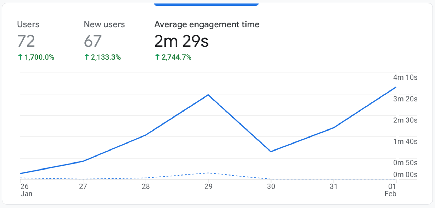
No product launch is truly complete for a product manager unless proper KPIs are established and tracked. Given that this is a personal website that I am not actively driving traffic to and lacks explicit action beyond providing information, KPIs were tricky to establish. However, my main goal was to engage visitors with content they might be interested in and so I am mainly tracking Google Analytics' "average engagement time" metric. As of writing this article, average engagement time is up over 2,000% compared to my older website.
